Communications Tools
Social Media and Newsletter Content
Twitter:
- New interactive map of #LifeExpectancy at birth data show people living just a few miles apart may have vastly different opportunities for a long life rwjf.org/lifeexpectancy
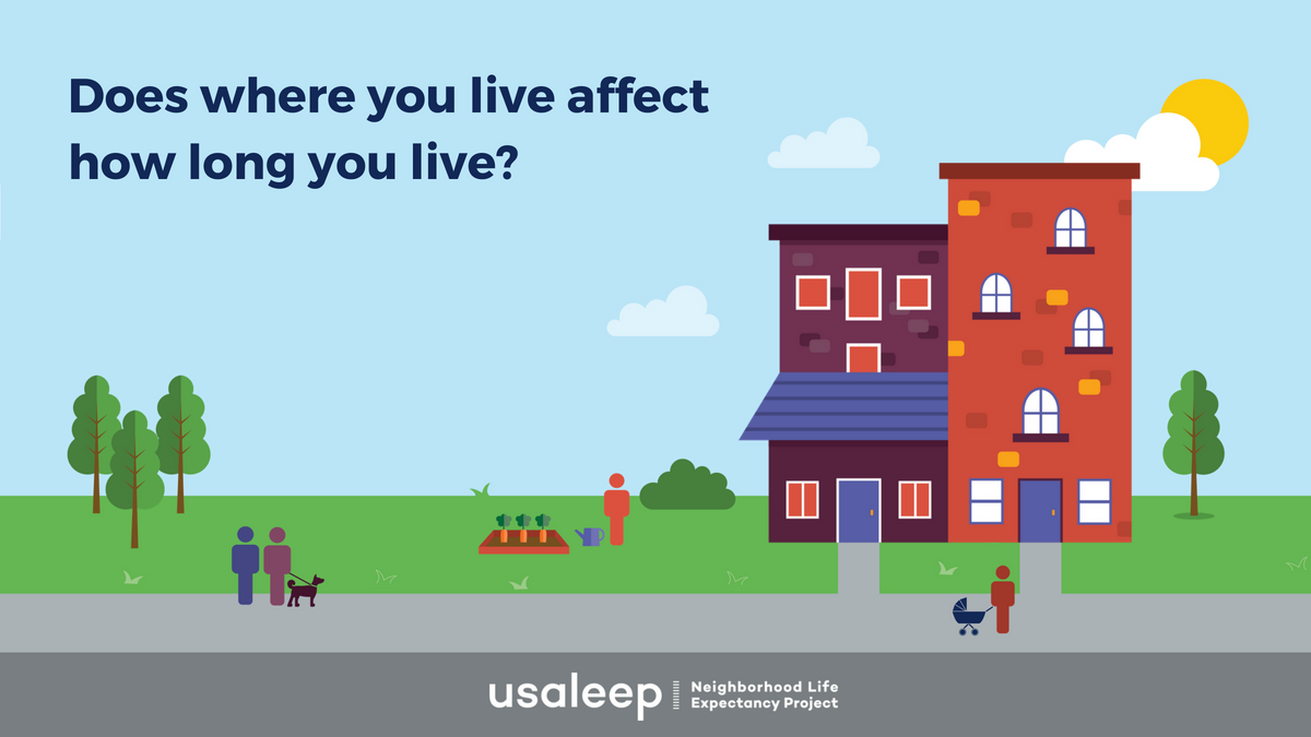
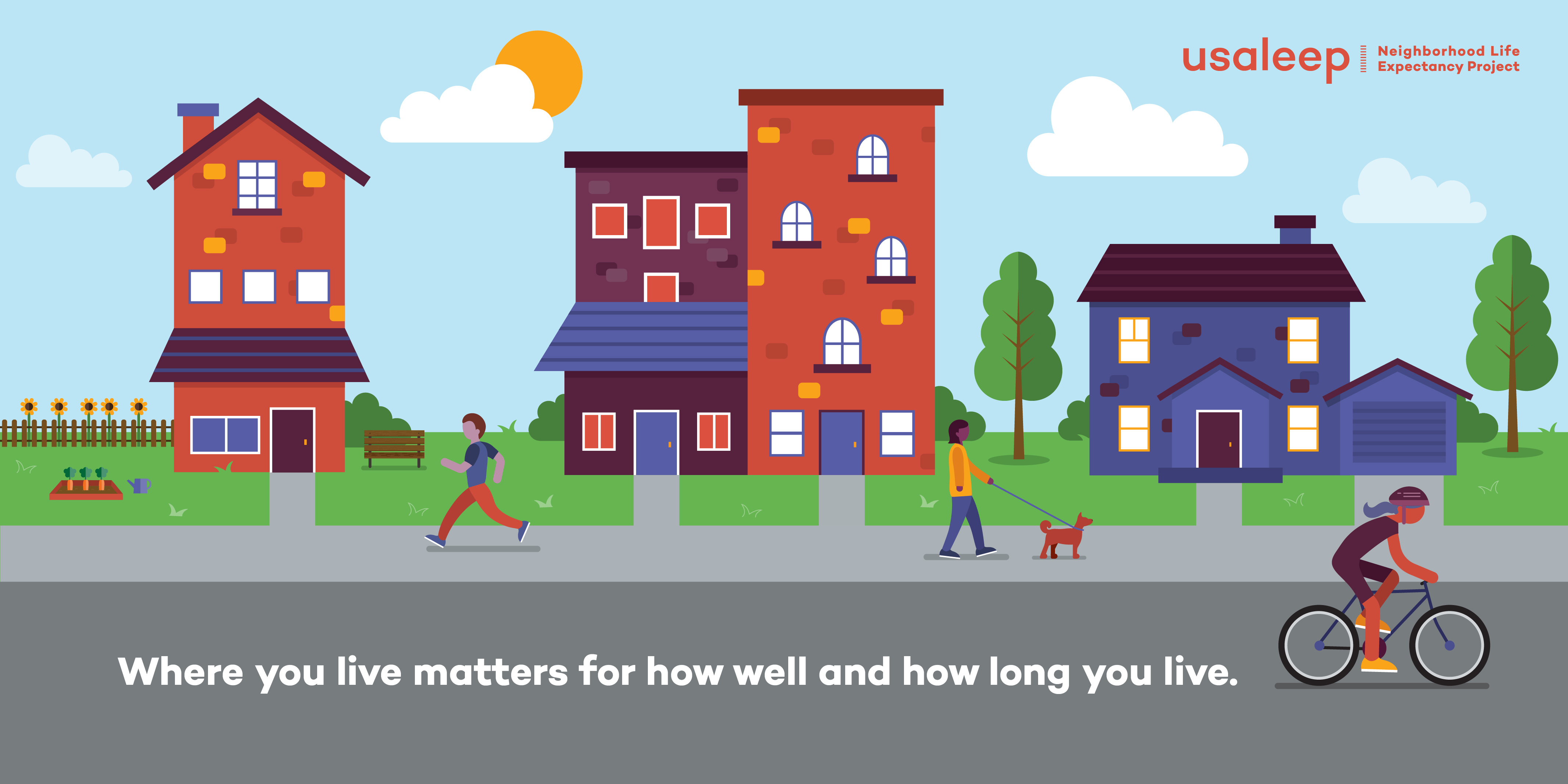
- Where we live makes a difference in how well and how long we live. Explore new interactive map with #LifeExpectancy at birth data for your neighborhood rwjf.org/lifeexpectancy
- Everyone deserves the same opportunity to live a long life – new interactive map with #LifeExpectancy at birth data show that isn’t happening as disparities in opportunity exist neighborhood-by-neighborhood rwjf.org/lifeexpectancy
- We all have a role to play in making our communities healthier. Explore new interactive map with #LifeExpectancy at birth data to pinpoint disparities and take action in your community rwjf.org/lifeexpectancy
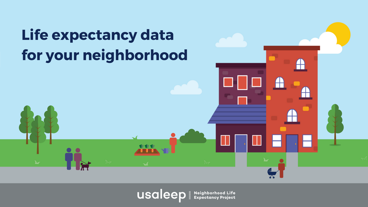
- Local solutions require local data. Explore new interactive map with #LifeExpectancy at birth data for your neighborhood, and all neighborhoods across the U.S. rwjf.org/lifeexpectancy
- The more local data are, the better we can understand differences among groups, and the more we can tailor solutions to create healthier communities. New interactive map with #LifeExpectancy at birth data at the neighborhood level can help rwjf.org/lifeexpectancy
- Differences in health aren’t unique to big cities, small towns, or rural areas – they’re a pattern across America. New interactive map with #LifeExpectancy at birth data at the local level can help increase understanding of these differences rwjf.org/lifeexpectancy
- New interactive map with neighborhood-level data on #LifeExpectancy at birth available now from @NAPHSIS_US, @NCHStats, and @RWJF. Check it out: rwjf.org/lifeexpectancy
- Where we live makes a difference in how well and how long we live. Explore new #LifeExpectancy at birth data for Maine! rwjf.org/lifeexpectancy
- Local solutions require local data. Explore new #LifeExpectancy at birth data for Maine, and all neighborhoods across the U.S. rwjf.org/lifeexpectancy
- Where we live makes a difference in how well and how long we live. Explore new #LifeExpectancy at birth data for Wisconsin! rwjf.org/lifeexpectancy
- Local solutions require local data. Explore new #LifeExpectancy at birth data for Wisconsin, and all neighborhoods across the U.S. rwjf.org/lifeexpectancy
- The more local data are, the better we can understand differences among groups, and the more we can tailor solutions to create healthier communities. New interactive map with #LifeExpectancy at birth data at the neighborhood level can help. rwjf.org/lifeexpectancy
Facebook:
- Where we live makes a difference in how well and how long we live. New interactive map with data on life expectancy at birth show that people living just a few miles apart may have vastly different opportunities for a long life. rwjf.org/lifeexpectancy
- We all have a role to play in making our communities healthier. Available now, new interactive map with data on life expectancy at birth at the neighborhood level can help you pinpoint disparities and start a conversation that leads to action within your community rwjf.org/lifeexpectancy
- The more local data are, the better we can understand differences among groups, and the more we can tailor solutions to create healthier communities. New interactive map with neighborhood-level data on #LifeExpectancy at birth can help rwjf.org/lifeexpectancy
- Where we live makes a difference in how well and how long we live. New interactive map with data on life expectancy at birth show that people living just a few miles apart may have vastly different opportunities for a long life. Explore [insert city/state name]’s data rwjf.org/lifeexpectancy
LinkedIn:
- We all have a role to play in making our communities healthier. Available now, new interactive map with data on life expectancy at birth at the neighborhood level can help us pinpoint disparities and start a conversation that leads to action within our communities rwjf.org/lifeexpectancy
- Where we live makes a difference in how well and how long we live. New interactive map with neighborhood-level data on life expectancy at birth show that people living just a few miles apart may have vastly different opportunities for a long life. rwjf.org/lifeexpectancy
Newsletter Sample Language
For the first time, public health officials, community leaders, and others working to improve local health can measure and compare differences in life expectancy at birth in nearly every neighborhood across the country with an easy-to-use interactive map. With this new life expectancy data tool, community leaders can examine the factors that may be influencing these health differences–such as access to health care, housing that is safe and affordable, child care, educational opportunities, and more–and target solutions more effectively. The United States Small-Area Life Expectancy Estimates Project (USALEEP) is a joint effort of the National Association for Public Health Statistics and Information Systems (NAPHSIS) and the Centers for Disease Control and Prevention’s National Center for Health Statistics (NCHS) and the Robert Wood Johnson Foundation (RWJF). Learn more: rwjf.org/lifeexpectancy